1. Welcome
This recording is about one and a half minutes. Welcome to the Valentine, a city history museum dedicated to collecting, preserving and interpreting the history of the Richmond region. We hope you enjoy this audio description for Sign Spotting: Richmond’s Signage. To hear about the museum’s campus and amenities, continue listening to this recording. If you would like to begin the exhibition now, skip to the next recording, “Sign Spotting Introduction”. The Valentine’s main campus is located in downtown Richmond and is comprised of a historic home, a garden and five exhibition galleries. On the ground floor of the Valentine museum, you will find our lobby which includes our front desk and museum shop. A museum scavenger hunt for kids is available at the front desk. The Valentine’s ground floor includes two galleries, our core exhibition This is Richmond Virginia as well as Sign Spotting: Richmond’s Signage which is on display from May 25, 2023 – May 31, 2024 in the Stettinius Community Galleries. The museum’s ground floor also includes the Wickham House, a historic home built in 1812. A guided tour of the home is included with admission. On the ground level there are exits that lead to Clay Street, 10th Street, the Valentine garden and Valentine Studio. Visitors are welcome to enjoy the garden at any time during your visit. The museum’s lower level can be accessed by stairs or using an elevator. Here you will find restrooms and water fountains as well as a rotating photo exhibition and other objects. There is also an emergency exit to the garden. Visitors to the museum are encouraged to take photos and ask our staff if you have any questions. All galleries and the Wickham House are stroller and wheelchair accessible.
2. Sign Spotting: Richmond's Signage Introduction
This recording is about one and a half minutes. When is the last time you slowed down and looked at all the signs around you? Do you think about who put them up? And why? Whether lit from within, glitzy with gold or hoisted up high, signs communicate. Signs are also location-specific, providing information within a defined space.
In Richmond, some signs contributed to the city’s growth and development. Others spread social ills. Many signs, intentionally or unintentionally, did both. This region, past and present, has some iconic signage that does not fit within the walls of a museum. Discover iconic Richmond signs in their original context with a map at bit.ly/signspotting.
The Valentine has partnered with Virginia Voice, an audio information radio reading service, to provide this audio description for the signs and text in this exhibit. Large print versions of the label text are also available in the gallery.
What is the purpose of signs? The object labels in this show are color-coded to highlight the key function of each sign to inform, advertise, or persuade. Each object recording will begin with the object name, donor and design function, followed by a description of the object and the museum’s informational label.
3. GRTC Bus Signs
This recording is a little over one minute. These signs are located to the right of the exhibit’s introductory panel. Here are two identical Greater Richmond Transit Company, or GRTC, Bus Signs. One is hung above the other. The bottom sign is not covered by plexiglass. This sign can be touched. Both of these signs are made out of metal. Both were produced in the 20th century. They are 3.5 inches tall, 3 inches wide, and are as thin as a mousepad. They are a rectangular shape, with rounded corners. The background is navy blue and there is raised silver lettering in the middle of the signs. There are narrow plates that attach to the back of the signs, and screws at the top and bottom used for mounting the signs to a pole. These plates are screwed into the exhibit’s walls. The touchable sign on the bottom displays some abrasions and the silver lettering has lost its shine. The one above appears smooth and its silver lettering gleams.
The object label reads: These older Greater Richmond Transit Company (GRTC) signs were located at bus stops in the Richmond region. They say “bus” in both English and Braille. In 2019, GRTC replaced these signs with newer versions that also provide the stop number.
Provenance
Gift of the GRTC Transit System
Information design
4. Esso Station Sign
This recording is approximately one minute. This piece, an Esso sign, is above the two GRTC bus signs. This is a neon sign that was created around 1948. The company name, Esso, is shaped from ruby red neon glass within a dark blue neon oval. The sign is around 36 inches long, 27 inches tall and 7 inches wide. At first glance, the sign glows a vibrant red that is encircled by a cobalt oval. Upon closer inspection, the second ‘s’ in the sign is duller than the other letters, but altogether the sign is bright and vivid.
The object label reads: Bright neon signs became popular in the 1920s as a way to help customers find businesses at night. This Esso gas station sign from Richmond Highway attracted drivers until Exxon took over most stations in the United States in the early 1970s.
Provenance
Gift of Mr. Robert Ziegler
Advertising design
5. Murphy’s Hotel Signs
This recording is approximately 2 minutes. These signs are located on the upper wall. They are above the stacked Arthur Ashe, Jefferson Davis, and Casablanca signs. These two side-by-side signs are the Murphy’s Hotel Signs. They were created between the years 1902 and 1907. They are metal and attached to a wooden board. The signs are 20 inches tall. They are each over 8 feet wide. They are one and a half inches thick. The sign on the left has the word “Murphy’s” on it. The sign to the right has the word “Hotel” on it. The letters are all capital and a light brown color. Though somewhat faded, they are still legible against the darker brown background. There is an accompanying black and white photograph below, to the left, and parallel to the Arthur Ashe and Jefferson Davis signs.
The photograph was taken around 1913. The hotel is seen from across the street. The shorter building on the right is the annex building that the Murphy’s Hotel sign is mounted onto. The hotel is 6 stories high with 3 columns of windows facing front. There are 5 fire escape ladders going up the front of the building. The Murphy’s Hotel signs are on the far left column. The Murphy’s sign is above 2 third story windows and the Hotel sign is above 2 second story windows.
The label reads: Murphy’s Hotel was located at the corner of 8th and Broad Streets in Richmond. In 1902, John Murphy added annexes to his 1886 hotel and in 1913 replaced the main building. This Cook Studio photograph shows the hand-painted signs on the 1902 annex building after the 1913 construction. Manuel Loupassi salvaged the signs around 1966 as the Commonwealth was converting them into office buildings. He later installed them in the Robin Inn where they outlived the original building, which was torn down in 2007.
Provenance
Gift of Carol Loupassi
Advertising design
Murphy Hotel graphic reproduction
Cook Collection
6. Arthur Ashe and Jefferson Davis Signs
This recording is approximately 2 minutes. These signs are to the right of the Murphy’s Hotel photograph and to the left of the Casablanca sign. The Arthur Ashe Boulevard Street sign is hung above the Jefferson Davis Highway street sign. Both signs are rectangular in shape. The plastic Arthur Ashe Boulevard sign was made in 2019, and is about 35 inches long. It is around 9 inches tall. In the middle of the top part of the sign, it is around 12 inches tall where a section of the sign slopes upwards. It is a quarter of an inch thick. The metal double-sided Jefferson Davis sign was made in the 20th century. It is 9 inches tall, 48 inches long, and a quarter of an inch thick.
The Arthur Ashe Street sign is blue and reflective. 2019 is written above the words N. Arthur Ashe Boulevard, all in white text. Each side of the Jefferson Davis Street sign has the same white text over a reflective green background. It reads “Jefferson Davis”. Smaller text to the right says H-W-Y over the number 1600. Both signs are designed to be inserted into a frame or bracket on a street sign pole.
The object label reads: How do you get around if you don’t know the area? Your GPS device may help you today, but in 1908 the Richmond Chamber of Commerce called for a unified system of street signs and numbers so that a person did not have to “depend on his guessing powers to get around and about.”
Naming streets also became a method for honoring individuals. In 2019, the City of Richmond honored Arthur Ashe, star tennis champion and humanitarian, by changing the name of Route 161 from “Boulevard” to “Arthur Ashe Boulevard.” In 1922, the General Assembly designated all of U.S. Route 1 in the state as “Jefferson Davis Highway” to honor the former president of the Confederacy. In 2021, Richmond renamed the road “Richmond Highway.”
Provenance
Gift of the City of Richmond
Information design
7. Casablanca Sign
This recording is approximately 2 minutes. This restaurant sign is mounted to the right of the stacked Arthur Ashe & Jefferson Davis street signs. This sign is titled Casablanca. This sign was constructed using plywood and paint. It was created in the 1990s. This sign is 38 inches in height and 36 inches wide.
This sign’s background looks like a blackboard. The uneven black paint has splotches of white and gray, as if chalk text has been wiped away. The text is all in white. The restaurant’s name, Casablanca, is handwritten in a decorative and bold font at the top of the sign. It takes up about a quarter of the sign. Underneath Casablanca, the restaurant has listed its operating times, which are Monday through Friday, serving lunch from 11:30 to 3:00 pm. Wednesday through Saturday runs from 10:00 PM to 5:00 AM. The words “Late Night” are written in Italicized font above these hours. Underneath the restaurant’s times is written “Quality, Catering.” Below this line, it appears as though the sign was cut and the wood repurposed. More lettering is visible, but it’s been cut very near the top of the letters to the point where additional words are difficult to identify.
The object label reads: Casablanca opened in 1994 as a jazz club with a Moroccan vibe and, by 1998, was known as “an older club well known in the gay community.” Today, Barcode operates in the same location and caters to Richmond’s gay, lesbian, bisexual and transgender/transsexual community. The hand-painted sign may have originally been a sidewalk sandwich board sign, but it was cut down and later used to board up a window on a Church Hill home.
Provenance
Gift of Bill Conkle
Advertising design
8. Chimborazo Sanatorium Sign
This recording is under one and a half minutes. This rectangular sign is hung near the ceiling above the Vepco and School Zone signs. An accompanying black and white photograph is located to the left of the Vepco sign and to the right of a set of double doors. This sign is the Chimborazo Sanitorium sign. It was made around 1908. The sign is 11 inches tall and 82.5 inches wide. It is 1.5 inches thick. It is a copper sign and shows signs of oxidation. It is mounted to a turquoise, wooden board with metal screws.
The photograph of the Chimborazo Sanitorium house was taken around 1908. The photograph is taken from across the street and to the left. The building is large and stately. It has 3 floors. There is a curved stairway on each side of the main entrance. There is a wrought iron fence on top of a low brick wall that runs along the front of the building. 4 large and 2 small windows can be seen. To the left of the building is a very tall tree. It is full of leaves.
The label reads: A sign maker used a hand-held tool to engrave and decorate the letters on this sign for the Chimborazo Sanatorium. Dr. William Henry Parker used the house at 2311 E. Grace Street, formerly the home of Civil War spy Elizabeth Van Lew, as a private tuberculosis hospital between 1908 and 1911. But the nearby residents did not want the hospital in their neighborhood. In 1911, the City of Richmond purchased the building and tore it down to make way for Bellevue Elementary School.
Provenance
Museum Purchase
Information design
Chimborazo Sanatorium graphic reproduction
Library of Congress
9. Virginia Electric & Power Company Sign
This recording is approximately 1 minute. This sign is to the right of the picture of the Chimborazo Sanitorium. This VEPCO sign was created at some point during the 20th century. This metal sign is approximately 32 inches long and just over 18 inches tall.
The arrangement of the company’s initials emphasizes the sign’s diamond shape. The letters fill in the diamond so that the first and last letters are small. The middle letter, “P”, is taller and the remaining letters stagger in size.
The object label reads: Logos are an important part of marketing for any organization. The utility company Virginia Electric & Power Company, known as “VEPCO,” used its name in its logo from 1925 until it rebranded as Virginia Power in the 1980s. Today the company is known as Dominion Energy and is still headquartered in Richmond.
Provenance
Gift of Virginia Power
Advertising design
10. School Zone Sign
This recording is under two minutes. This display is to the right of the VEPCO sign and the last piece on this wall. This metal sign was made in the 1950s. On its own and without a stand, the sign is about 60 inches tall and 30.5 inches wide.
The sign is designed and shaped to look like a broad-smiling policeman. The policeman is wearing a deep blue suit. He is also wearing white gloves and a policeman’s hat that has been embellished with a silver badge. His left hand is lifted to signal drivers to stop. In his right hand is a large yellow sign that states in all capital letters, “Slow, school zone.” All around the edges of this figure are rivets that connect the metal back and front together. The way the material was molded gives the figure a more 3-dimensional look.
The accompanying black and white photograph is of the Thomas Jefferson High School entrance in March 1956. The school zone sign is shown standing with a stone wall to its right. Behind the sign and to the left are two wooden double doors.
The label reads: Sign technology and rules have changed over time. In 1947, the State Highway Department updated the rules for school zone road signs, requiring movable “School Zone” signs in the road during school session. This sign or one similar to it directed 1950s drivers to slow down while cruising past Richmond’s Thomas Jefferson High School on West Grace and Malvern streets. The flashing lights used today first appeared in Richmond in 1955 at Ginter Park Elementary School on Chamberlayne Avenue in Northside.
Provenance
Museum purchase
Persuasive design
Thomas Jefferson High School Entrance graphic reproduction
Photographed by J. Haden Hankins
Hankins-Cottrell Photograph Collection
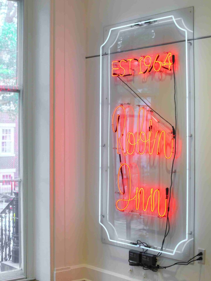
11. Robin Inn Sign
This recording is under 3 minutes. The Robin Inn sign is mounted on a wall opposite the School Zone sign and to the right of the windows. A print of a Robin Inn’s menu cover is displayed on the same wall to the right of the sign. The Robin Inn sign was developed in the 1970s. It is 80 inches tall and about 40 inches wide. The sign’s neon glass tubes have a diameter close to that of an adult pinky finger. Neon glass tubing creates a white glowing frame around the words “Robin Inn”. This frame is a vertical rectangle. The corners of the frame are curved inwards, like the shape of a raffle ticket. The words “Robin Inn” are centered in large cursive letters. The word Robin is placed above the word Inn. Each word is shaped by a single strip of a neon glass tube. The pair of words is approximately 40 inches tall and 20 inches wide. Both words glow bright red, creating a red glow on its surroundings.
The Robin Inn menu cover is slightly larger than a sheet of paper. The menu cover design was developed in 1968. The background is a pale salmon pink. Thin, darker pink circles of various sizes overlap throughout the background, creating a ripple effect. The words “The Robin Inn” are written in the upper half portion of the page in black print. The word “Robin” is printed in the center and is much larger than the words “The” and “Inn”. The word “The” is written in the upper left. The word “Inn” is written below and to the right of “Robin”. The font for “Robin” is written in cursive. The words “The” and “Inn” are written in capital and angular letters. An image of a bird is below the Restaurant’s name and on the right side of the menu cover. The bird is between 2 to 4 inches tall. It is drawn in only black ink, but is detailed to look like an actual bird. The bird is viewed from the side and is looking slightly towards you. Its mouth is agape, as if it is calling. A wide line zigzags down from the top of the menu. This line creates a pointed loop underneath the word Robin. It then veers off to the right underneath the bird. Black lettering near the bottom of the menu lists the Robin Inn’s address and indicates Free Home Delivery.
The label reads: Manuel Loupassi, a Greek immigrant and Holocaust survivor, acquired the Robin Inn at 2601 Park Avenue in 1964. The Loupassi family operated the restaurant in the Fan for nearly 60 years. The glowing window sign attracted locals to this gathering spot serving Italian, Greek, and American favorites until closing in 2022.
Provenance
Gift of Carol Loupassi
Advertising design
Robin Inn menu graphic reproduction
Gift of Carol Loupassi
12. Images of Richmond During COVID-19 Pandemic
This recording is about four minutes. There are two columns in the middle of the exhibit. Please stand in between the two columns. Please then turn to face towards the exhibit’s entry. You are facing the Museum’s label of this display.
The label reads: Signage has been a key communication tool during the COVID-19 pandemic. In 2020, signs reminded people to remain 6 feet apart, shared details about openings and closing, and provided directions for safe and healthy access. They also provided uplifting messages during a traumatic experience. These images capture just some of the signs that appeared in the Richmond region during the early months of the pandemic.
There are 12 pictures in this display, each about the size of a sheet of paper. 3 photographs have been selected for further description.
Step to the right side of the column. The photograph on the top row is the first stop. This picture was taken at Market at 25th Street in Church Hill. It shows a section of 3 rows of black metal shelves in the aisle of a store. All three shelves are empty. A horizontal, rectangular paper sign is attached to the top row of the shelves. A message printed in black ink reads, “All bathroom tissue, limit 2, per person, per day.” Two more signs like the one just described are attached to empty shelves further away.
Step to the right again to the next side of the column. The next photograph described will be the second from the top. This picture shows the front entrance of Sub Rosa Bakery in Church Hill. To the left is a brick sidewalk leading away. In the center of the image is a tall black chalkboard sign leaning against a faded red column. At the top of the sign, handwritten white chalk words read “Open for online orders only”. To the left of the sign is a red metal fold-out table. The center of the sign shows a white arrow drawn facing towards the table. Words written next to the arrow say “We will place your order on this table once you let us know you have arrived.” At the bottom of the sign is the message that states “Thank you all for your cooperation, kindness, and patronage. We love you. Sub Rosa”. Large potted plants flank the doorway behind the sign. A rope is tied between them. Behind the rope is a young lady wearing a white cloth mask. She is opening a faded red door that has a large glass window.
Go ahead and walk right to the last side of the column. On the row second from the bottom is the last image that will be described. This picture was taken at the Virginia Museum of Fine Arts. A dark gray sign covers the right side of the image. It is in a shaded, outdoor area. The sign appears smooth and has a black metal frame. Light gray print covers the sign. The sentence “HELP STOP THE SPREAD OF COVID-19” is written in capital letters. Beneath this line is an image of a light gray block. Five dark-gray silhouettes of people are scattered within. Thin arrows point in between the figures. The first sentence in the paragraph written further down the sign states, “As you enjoy VMFA’s sculpture garden, please practice social distancing.” Walking towards the left is a man wearing a blue bandana around his mouth and nose. To his left, a short tree in a vivid orange pot, colorful flowers, a pond with reeds, and tall leafy trees.
Provenance
Photographed by Elaine Odell
Collected by Museum
Information design
13. Ignatius Hats
This recording is under one and a half minutes. This Ignatius Hats sign is hung near the ceiling between two columns that are in the middle of the exhibit. This is a wooden sign with a painted design. It was created in 1999. It is 26 inches tall and 48 inches wide. Even though the sign is flat, it has a lot of depth. This sign is in the shape of a cylinder hat box. The hat box is a pale yellow with muted green stripes. The box lid, though tied with a black ribbon, is slightly ajar. A feather plume of the same color as the green stripes is sticking out of the box. This design is painted on both sides of the sign.
The object label reads: Richmond milliner Joseph Ignatius Creegan (known to all as Ignatius) was a self-taught hat maker. He started making hats in 1985 in the Richmond Dairy building, and in the 1990s he and partner Rod Givens had a studio in Scott’s Addition. In 1999, they opened a storefront in Carytown at 2925 West Cary Street. Ignatius designed this two-sided outdoor sign to look like a hat box, and Ashland-based sign maker Phil Bagby brought it to life.
Provenance
Gift of Rod Givens of Ignatius Hats
Advertising design
14. Images of Multi-language Signage in the Richmond Region
This recording is under four minutes. There are two columns in the middle of the exhibit. Please stand in-between the two columns. Next, turn to face away from the entrance of the exhibit. You are facing the Museum’s label for this display titled “Images of Multi-Language Signage in the Richmond Region”.
The label reads: The U.S. Census Bureau found that in 2021, 7% of families in the Richmond region spoke a language other than English in their home, ranging from 2.8% in Powhatan County to 15.3% in Henrico County. Linguistic diversity is also seen in the region’s signage.
There are 12 photographs in this display, each about the size of a sheet of paper. 3 images have been selected for further description.
Step to the right and pass by one wall of the column. Stop at the second wall that you come to so that you are on the opposite side of the column that the museum’s label is hung on. The first photograph that is described is in the second row from the top. This is a photograph of Tan A Shopping Center in Henrico. The outside wall of a tan-colored stone building covers most of the image. A row of windows covers most of the lower strip of the building. Large red letters run horizontally across the top part of the wall. The letters spell out “Tan A Supermarket”. 6 traditional Vietnamese characters are above the English letters. Each letter and character are separate from the others and raised from the wall.
Now the image that is on the bottom row will be described. This photograph is of the outdoor sign for Richmond Korean Presbyterian Church in South Richmond. A rectangular platform of bricks creates a border for a white sign. Korean letters are printed in black across the top of the sign. Their alignment is slightly rounded. Center in the sign is an image of the Presbyterian Seal. Several blue lines create the shape of a cross. On each side of the bottom of the cross is a curved red line. The lines curve upwards, like the shape of a flame. Underneath this image are the words “Richmond Korean Presbyterian Church. Pastor: Youngho Lee”.
Go ahead and step right to the fourth side of the column. This is a photograph of the Lindo Amanecer Latino Market & Restaurant in South Richmond. The left half of the image consists of a single-story brick building. In the center of the image is a sign that is as tall as the building. The sign’s pole protrudes from the ground in the lower center of the image. It is a faded red and leaning slightly to the right. At the top end of the pole is a large circular sign. The pole and the sign together create the shape of a magnifying glass. The sign has a white background. Black letters are printed in a circular shape around the sign. “Lindo Amanecer” is written around the top and “Latino Market and Restaurant” are written around the bottom. In the center of these letters is a circular image of a beach landscape. An ocean short with palm trees covers the lower half of the image. Mountains are in the distance. Half of a sun protrudes from behind the mountains. White letters in the ocean read “Musica y otros producyos”. Underneath is the English translation, which reads “Food, music, and other products”.
Provenance
Collected by Museum
Advertising design
15. Long Live Neighborhood Schools Sign
This recording is less than 2 minutes. It stands alone on its own wall to the left of some windows and across the Colored Waiting Room door. This sign reads “Long Live Neighborhood Schools”. It was created around 1973. The sign is 48 inches tall, 48 inches wide and less than an inch thick. Around the perimeter of the sign are slight signs of wear that show through discolorations and small chips of paint that have been lost over the years. The once white background is more of a cream color now. The sign is divided into thirds with evenly spaced text. The top and bottom thirds have bolded capital letters hand-painted in a navy blue that is bordered by light horizontal blue lines. In the middle, the word “neighborhood” is all in lowercase letters. The letters create a wave across the sign in a cherry red color. Two light blue 5-pointed stars are placed above and below the red text.
The label reads: Following the U. S. District Court’s 1972 decision to help desegregate Richmond region schools by busing students across city-county boundaries, many parents organized groups opposed to busing. Along with hand-painted lawn signs like this one, they created pins and posters that were used at rallies and meetings to promote their viewpoint. The U.S. Supreme Court overturned the cross-municipality busing decision in 1973.
Provenance
Gift of Robert C. Layton
Persuasive design
16. Colored Men Waiting Room Door
This recording is approximately 1 and a half minutes. Standing opposite of the “Long Live Neighborhood Schools” sign is a red door. This architectural fragment is a segregation-era door from around 1907. The door stands 83 inches tall, 32 inches wide and 2 inches deep.
The door’s paint color is a faded tomato red. The top half of the door has a glass panel that has been painted over to match the rest of the door. The outline of the text “Colored Men” is faintly visible through the paint. Furthermore, this door appears to have a hole towards the lower left side in the glass pane. The door has a metal hasp for locking, which is bent. There are doorknobs on both sides.
The brass door handles are small and round. The knobs’ faceplate has been painted the same red as the door.
The object label reads: Constructed during the Jim Crow era (1880s–1960s), the Richmond & Chesapeake Bay Railway Depot at West Broad and Laurel Streets opened in 1907 for electric rail service to Ashland. This waiting room door from the second floor, labeled “Colored Men,” reinforced the policy of racially segregated public transportation. The sign was later painted over, likely after the Civil Rights Act of 1964 outlawed segregated public facilities.
Provenance
Gift of Virginia Commonwealth University, School of the Arts
Information design
17. Jennifer McClellan Yard Sign
This recording is about 2 and a half minutes. This stop includes two political campaign yard signs that are to the right of the Colored-Men waiting room door. The Jennifer McClellan sign is hung above the Panny Rhodes sign. Each sign is approximately 18 inches high and 24 inches wide.
Jennifer McClellan’s sign is made of plastic coroplast and is primarily blue. The sign’s background is a deep navy blue that is divided into thirds. The top and bottom thirds have text that is in a light blue color. Next to Jennifer’s name, is the outline of the state of Virginia also in light blue. The middle of the sign includes a white banner that emphasizes the candidate’s last name, McClellan.
Panny Rhodes campaign yard sign is made of coated cardboard. It is predominately red with a navy blue banner at the bottom of the sign. This banner reads “For the House.” All text is in white and there is a white border around the entire exterior of the sign.
The label reads: Republican Ann “Panny” Rhodes represented parts of Richmond and Henrico County in Virginia’s House of Delegates from 1992 until 2001. After serving the Richmond region in state government for 17 years, in 2023 Democrat Jennifer McClellan was elected as the first Black woman from Virginia in Congress. In a 1994 decision, the U.S. Supreme Court protected a property owner’s right to display yard signs and noted “displaying a sign from one’s own residence often carries a message quite distinct from placing the sign someplace else.” A 2004 Virginia law supports this ruling.
Provenance
Collected by Museum
Panny Rhodes Yard Sign
Valentine Collection
Persuasive design
18. Ground Glue Sign
This recording is about three minutes. A set of double doors are to your right and two political yard signs are to your left. This Ground Glue sign was made from glass around 1890. The sign is about 40 inches tall and about 30 inches wide. It is a vertical rectangular shape. The background of the sign is a smooth black. Gold paint is used for the decorative lettering and details throughout the design. The elaborate gold frame around the sign is covered in floral and leaf details.
A thin gold line traces the rectangular border of the sign. Another thin gold line divides the sign horizontally into two equal parts. The upper half consists of the words “Ground Glue” written in gold capital letters. The words angle slightly upwards as they extend towards the right. The G’s in each word are larger than the following letters. The ends of the G’s continue into a swirl. The G in “Ground” also has a thin gold line going vertically through the middle. A thin gold line with small rounded accents stretches in between the two words. In the triangular space in the upper left of the sign, another thin gold line bends into a sideways V shape.
In the lower half of the image is the phrase “Manufactured by Thomas Christian.” “Thomas” is abbreviated as T-h-o-s. The R in Christian hooks slightly downwards. Beneath the word “Christian” is the painting of an unrolled scroll. It extends horizontally. It appears 3 dimensional and each end of the scroll curls. The scroll has a painting of a landscape on it. A body of water covers the left side of the scroll. In the center of the scroll, a canoe sits on the shore next to a tall stick protruding from the ground. To the left of the canoe is the figure of a person, who is standing on the sandy shore. The person is wearing a long red dress and white bonnet. A field in the distance shows a wooded area beyond. The light blue sky is fiery orange and yellow in the center. In the bottom left of the ground glue sign, a cluster of ferns and reeds grow upwards. The slender gold plants extend 3 quarters of the way up the sign. In the bottom right of the sign is the manufactory’s address: “1418 Main Street, Richmond, Virginia”.
The object label reads: This sign advertised Thomas Christian’s ground glue manufactory that operated at 1418 East Main Street in Richmond from 1871 until 1904 and continued at the Tobacco Exchange until Christian’s death in 1914. His factories made a solid form of glue that was ground into small pellets and hydrated prior to use. To make this sign shimmer, the New York sign maker hand-applied real gold and paint on the back side of the glass, a technique called églomisé.
Provenance
Gift of Rebecca Perrine
Advertising design
19. Sam Miller’s Warehouse Sign
This recording is about 1 and a half minutes. This is the Sam Miller’s Warehouse exterior retail sign. This expansive sign spans most of the upper wall, with its center sitting above the double doors that are located in the middle of the wall. The sign was created around 1983. It is over 19.5 feet long and is 16 inches high.
The sign’s backdrop is dark green. Its letters are painted in varying tones of yellow and given a drop shadow to create the appearance of depth. The sign has a gold-yellow border on all four edges of this rectangular sign. The far left and right ends have a dark square with a gold triangle at each corner. In addition, there is a multi-toned diamond shape at the beginning and end of the text. The hand-painted lines and shadows are precise and give the illusion that the letters have been added separately to the sign.
The label reads: Samuel Miller, part of Richmond’s Jewish-Polish community, opened a saloon in Richmond’s Shockoe Slip around 1901, but went bankrupt in 1907. Almost 70 years later, Thomas Leppert and Cliff Cline opened Sam Miller’s Seafood Exchange, helping to revitalize Shockoe Slip. In 1983, the restaurant merged with The Warehouse to become Sam Miller’s Warehouse, and today is known as Sam Miller’s on East Cary Street.
Provenance
Gift of Steve Rula
Advertising design
20. Visiting Room Sign
This recording is about 1 minute. The sign for this stop is to the left of the Overnite sign. This rectangular sign is made from metal. It was made sometime in the 20th century. It is one foot tall, three feet wide, and a quarter inch thick.
The background is white. Black capital letters spell the words Visiting Room. A black arrow below the text points to the right. One hole used for hanging is at both the top and bottom of the sign.
The label reads: Opened in 1800, the Virginia State Penitentiary was located on Spring Street in Richmond until it was demolished in 1991. The prison housed inmates from around Virginia. Visitors traveled from all over and were directed to the visiting room. By 1980, the room seated about 40 inmates and visitors at round lounge-style tables.
Provenance
Gift of Ethyl Corporation
Information design
21. Overnite Sign
This recording is approximately 1 minute. This sign is in between the Visiting Room sign and the No Smoking sign. This is an Overnite Transportation Sign. This metal sign was made some time in the 20th century. It is diamond-shaped with rounded corners. It is 4 feet tall, around 6 feet wide, and a quarter inch thick.
The background is dark blue with a gray border. There are 3 gray stars across the top. Underneath the stars are all capital, gray letters that say “Overnite” The font is stylized with lines dragging to the left to imply speed.
The object label reads: Can you almost hear the whoosh of a truck go by? J. Harwood Cochrane established Overnite Transportation, a Richmond-based freight company, in 1935. Beginning with one tractor, one trailer and one straight truck, Cochrane grew the company into a massive fleet specializing in the less-than-truckload (LTL) shipping sector. Their logo lettering even conveys their promise: speed.
Provenance
Museum purchase
Advertising design
22. No Smoking Sign
This recording is less than 2 minutes. Gifted by the Tobacco Row Associates, this placard sits to the right of the Overnite sign. This is the “No Smoking Sign,”. It was made from wood in the 20th century. The sign measures 6.5 inches high by 19 inches wide and a half inch deep. This small sign clearly proclaims “Positively No Smoking” in faded black letters on a light oak background. A stencil was used to create the text. There are two brass pins holding the wood sign onto a back plate that has been stained a darker wood color.
The label reads: Valentine staff found this stenciled sign in an old tobacco warehouse at 2300 E. Cary Street in the early 1990s. Built in 1901 for the American Cigar Company, the building was later used by Lorillard and Philip Morris for tobacco leaf storage. Ironically, these tobacco companies did not ban smoking for health reasons but to prevent fires. Renovated into apartments in 1999, the River Lofts at Tobacco Row went smoke-free in 2016.
Provenance
Gift of Tobacco Row Associates, L.P.
Persuasive design
23. No Stadium Sign
This recording is approximately 1 minute. This stop is located in the corner below the neon Bus sign. This Anti-Stadium sign was made in 2004 out of plastic coroplast. This flat sign is one foot tall and 18 inches wide. The background of this sign is yellow. Black print on the sign reads, “No stadium in Shockoe Bottom” These letters are all capital. Printed below is the message “Save the valley where Richmond began, www.richmondneighborhoods.org”. The sign also bears the floral-style emblem of the Alliance to Conserve Old Richmond Neighborhoods.
The label reads: A yard sign is a cost-effective way to show your support or opposition. In 2004, local leaders and owners of the city’s minor league baseball team, the Richmond Braves, proposed building a new baseball stadium in Richmond’s Shockoe Bottom. Residents protested the proposal, and signs like this helped persuade city leaders to abandon the idea. Nearly 20 years later, plans are in place to build the new stadium next to the Diamond along Arthur Ashe Boulevard.
Provenance
Gift of Teresa Roane
Persuasive design
24. Neon Bus Sign
This recording is approximately 2 minutes. There are two pieces within this stop. In the middle of the upper wall, above the exit door is a 1950s neon bus sign. The second piece is a picture of the Trailways Bus Station in 1953. The neon bus sign glows a vivid red. The very rounded font of the text almost makes the letters look like they could be balloons. The picture of the bus station shows the entire building from across a street intersection. The building is one-story that expands across a large block. The neon bus sign is sticking out from the right side of the building, over halfway up the wall. The station has white exterior walls. There are three doors distributed across the building’s front and separated by large windows. A large vertical sign indicates the station’s main entrance. There are about 8 people walking around the building, with many close to the building’s entrance. Behind the station are distant high-rise buildings in Richmond and one building that has steam or smoke rising from it.
The label reads:
Located at 9th and Broad Streets (where the Library of Virginia now stands), the Trailways Bus Center was the location of the 1958 arrest of Bruce Boynton, a Black law student at Howard University. Police arrested Boynton for trespassing after he ordered a cheeseburger in the “whites only” section of the station’s restaurant during a layover. He appealed his arrest, and in 1960 the U.S. Supreme Court decided in his favor, ruling that segregation on public transportation violated the Interstate Commerce Act that prohibited “unjust discrimination.”
Provenance
Gift of Virginia Parking Service
Advertising design
Trailways Bus Station graphic reproduction
Richmond Chamber of Commerce Photograph Collection
25. Show Us Your Sign
To the right of the gallery’s exit, you will find an interactive space. This station is titled “Show us your sign”. A magnetic white board is attached to the wall where visitors can draw their own sign using markers and paper. Beneath the white board is a cubby with several baskets on its shelves. These baskets contain varying materials that you can touch to get an idea of what the other signs in this exhibit feel like. Materials include glass tiles, aluminum plates, wooden squares, and coroplast yard signs.